Welcome to the very first post of the brand new Southern Connecticut Weather 2.0, the 2014-2015 Southern Connecticut Weather Winter Outlook! This outlook will examine the forecast for meteorological winter, that being December through February. A separate forecast for March will follow in early February. If you’re just looking for a quick read, we summarize the forecast at the end of the discussion, but we highly suggest that you read through the discussion, as it provides useful insight and analysis as to why we’re thinking what we are. We love questions, so if you have any or just want to comment on something, leave us a comment at the bottom of this post and we’ll get back to you ASAP!
This piece aims to provide an overview of the current information available with regards to making a long term forecast, and analyzes that information to produce a forecast for temperatures and precipitation for the state of Connecticut. As with any long term forecast (or really any forecast for that matter), it should be seen as more informational and perhaps guidance as to what might happen over the winter. Things change very quickly in the meteorological world, and as a result, long range forecasting has a notoriously low accuracy rate compared to the closer in forecasts. However, it’s still interesting to look into the longer range and make a prediction, and when you’re working in more general terms, there’s a much higher chance of success. As a result, in this outlook, we’re going to stay away from too specific numbers in favor of more general ranges and probabilities, which have a higher chance of being accurate.
As forecasters, when preparing a long-range outlook, we look at a number of different tools and data sources to help us. Those tools are long range models, analogs(Past winters with similar patterns in the upper levels of the atmosphere to what we’re currently seeing now), ENSO(The El Nino Southern Oscillation, commonly referred to as El Nino or La Nina), Teleconnector forecasts (NAO, AO, PNA, EPO), and finally, current conditions that we’re already seeing developing and how those might relate to the winter. Each of these will be weighted approximately equally, with the lowest weight on long-range models and the highest on teleconnectors. Gut feeling and overall trends will be used as needed. Let’s go through these one by one, and see what they might mean for Connecticut.
First, let’s take a look at long range models. These will have the least weight in the forecast mainly due to their poor verification rates and glaring biases, but they are worth studying because one can make inferences from them based on what they are (or aren’t) showing. There are three main ones that are used in long range forecasting, those being the CFS, JAMSTEC, and ECMWF monthly. Let’s examine them one by one.
First, we have the CFS, or the Climate Forecasting System, brought to you by NECP and NOAA. The CFS has a bias for being notoriously warm in it’s forecasts, so usually, a forecast from the CFS for a degree or two above normal is indicative of a near normal forecast in reality. The following three images are the CFS’s forecast for temperatures for December, January, and February. Click each image to enlarge it.
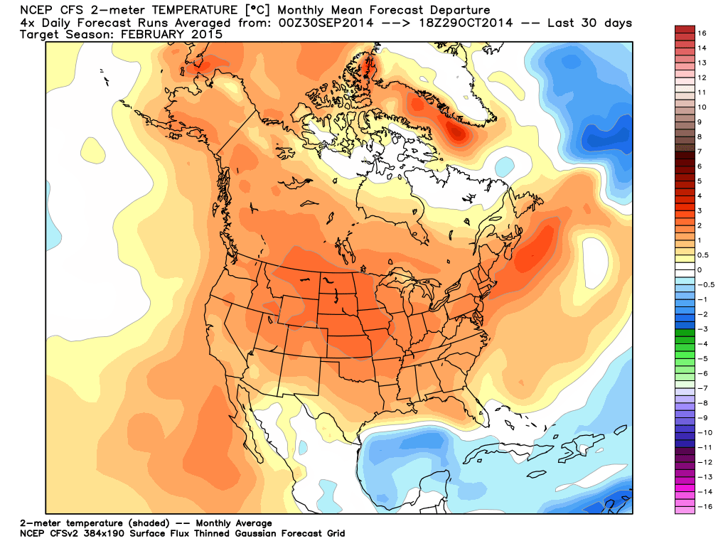
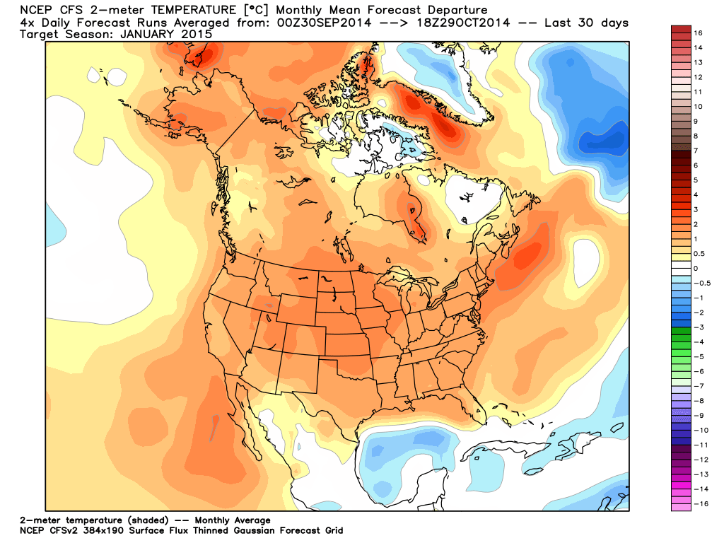
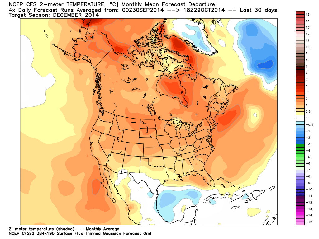
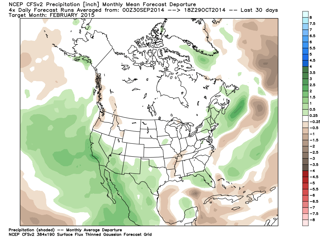
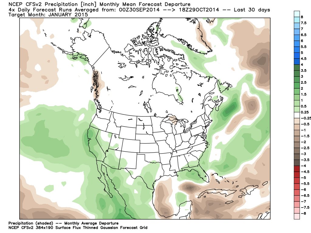
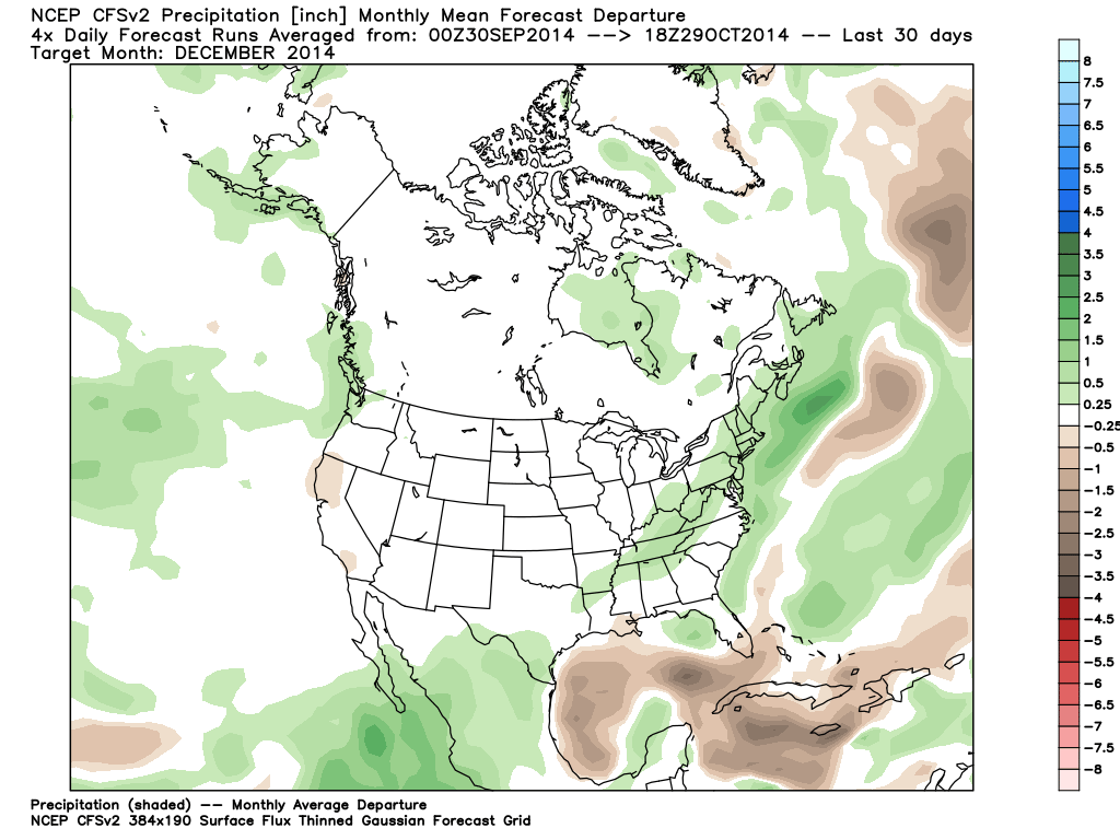
You’ll notice that the model is fairly consistent at forecasting temperatures one to two degrees above normal for the area. Taking into account the bias of the CFS, we can take from this that it has no real leaning either way towards warmth or cold for the upcoming months. If it were showing an extreme on one end or the other, it would be worth examining, but it is not, and therefore we can essentially toss it. The next three panels are the CFS’s forecast for precipitation, again from December, January, and February. Again, click on an image to enlarge it.
The model seems to be consistent with a theme of slightly above normal precipitation for the area, on the order of 10 to 20% once you compare the raw values to monthly averages. The CFS has no known bias towards precipitation amounts, so we’ll take this at face value, but discount it because of the generally abysmal performance of the model overall.
Moving up the ladder of performance slightly, we come to the JAMSTEC model. The JAMSTEC is a model issued by the Japanese weather offices, and while primitive, is fairly strong in terms of accuracy, especially recently. The next two images are the expected departures from normal for precipitation and temperatures over the three month period for Winter 2014-2015. My apologies for the poor graphics, they are the only ones that we can legally share because they are not from a paid service. Again, click the image to enlarge.
Moving up the ladder of performance slightly, we come to the JAMSTEC model. The JAMSTEC is a model issued by the Japanese weather offices, and while primitive, is fairly strong in terms of accuracy, especially recently. The next two images are the expected departures from normal for precipitation and temperatures over the three month period for Winter 2014-2015. My apologies for the poor graphics, they are the only ones that we can legally share because they are not from a paid service. Again, click the image to enlarge.

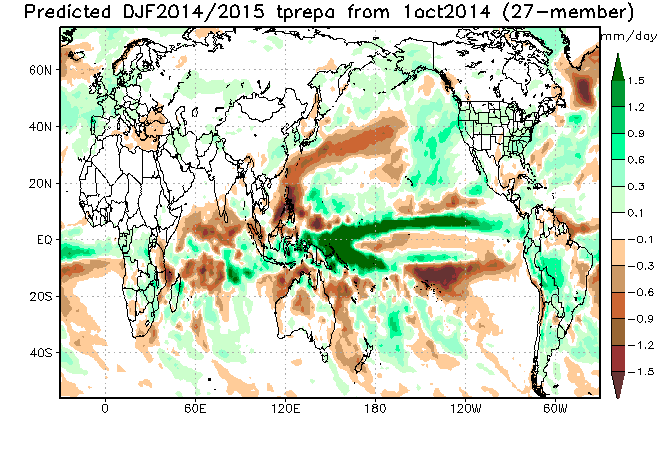
You’ll notice that the JAMSTEC keeps a similar theme to the CFS: above normal precipitation, and slightly above normal temperatures. Looking at the precipitation output, it estimates an anomaly of around .3 mm per day, which is equal to 10 mm per month or around .4”. This is a similar number to the CFS, perhaps slightly closer to normal. As far as temps go, it’s expecting us to be on average between .1 and .3 degrees Celsius above average for the three month period, or somewhere between .2 and .55 degrees Fahrenheit, so slightly above normal.
Finally, we come to the monthly version of the ECMWF, considered the best of the three longer range models. Unfortunately, I don’t have access to the monthlies since it is extraordinarily expensive, but I’ve seen them through sources of mine that do, and you’ve probably seen them published in places like Accuweather. They start off slowly in December with above normal temperatures, and then get going for the second half of winter with above normal precipitation and below normal temperatures. They also bring back the strong –EPO which we saw last winter, that lead to the cold shots that left many of us with record lows. While it isn’t forecast to be as strong as we saw last year, it is worth noting.
All in all, to summarize the long range models: Normal temperatures and above normal precipitation.
Next, we turn our attention to ENSO. You’ve probably heard talk in the media about a developing El Nino, and the impacts it could have on our weather patterns. El Nino is in effect when a warmer than normal band of ocean water develops in the central and eastern regions of the equatorial pacific. It’s counterpart, La Nina, results from cooler than normal temps in those areas. Previously, earlier in the summer, some of the models were showing a “super nino” developing, which would have meant much warmer than normal temps in those areas and as a result it having a much stronger impact on the pattern, but, in recent months, we’ve seen model projections and actual realities come to terms with a weak to possibly low end moderate El Nino, generally categorized as having SSTs of +.5 to +1 Celsius. Those temperatures are measured in four distinct regions, with the various regions corresponding to different bases for the El Nino(East based vs. West Based). Here is an image from the CPC (Climate Prediction Center, a NOAA office), showing the current values for those regions, and the trend over the last 12 months.
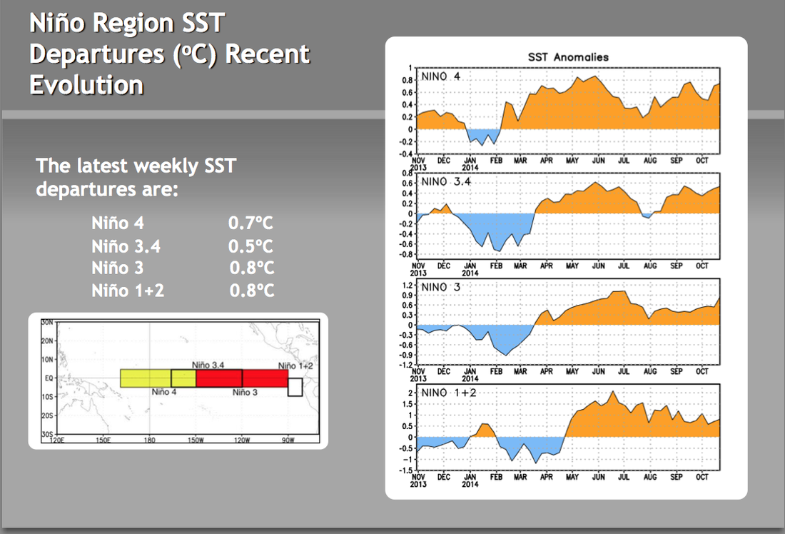
As you can see, Nino 3 and 1+2 are the east based regions, which means the values are slightly higher in the eastern areas and we’d be looking at an east-based nino, but with differences that small, the difference between east and west isn’t that big a deal and isn’t really worth diving into here.
So, what does El Nino mean for our weather? Let’s take a look. The map below us is the average temperature departure for DJF in all years classified “El Nino” by NOAA. The first row of maps is the average, the second is the trend, the third is the average and trend blended. We consider all of them, but in this case, they are all fairly similar, so we’ll look at the averages in this discussion. The first column of maps are the raw averages, the second column are the frequency with which the average occurred.
So, what does El Nino mean for our weather? Let’s take a look. The map below us is the average temperature departure for DJF in all years classified “El Nino” by NOAA. The first row of maps is the average, the second is the trend, the third is the average and trend blended. We consider all of them, but in this case, they are all fairly similar, so we’ll look at the averages in this discussion. The first column of maps are the raw averages, the second column are the frequency with which the average occurred.
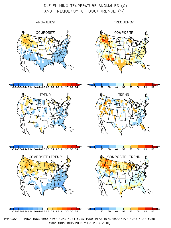
In terms of raw averages, El Nino averages slightly cooler than normal across our region. In terms of frequency, you see below normal temps about 60 percent of the time, meaning that it’s a decent indicator, but not a sure thing by any means. There’s no noticeable trend toward warmer or colder, so the averages are probably a good estimate.
Here’s the precipitation map. Read it the same way you read the temps map.
Here’s the precipitation map. Read it the same way you read the temps map.
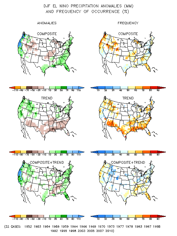
Similar to the long range models, El Nino advocates for above average precipitation in Connecticut, again with a near 60% chance of occurrence and no noticeable trend.
Finally, here’s the snowfall map
Finally, here’s the snowfall map
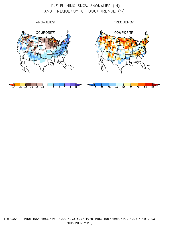
Looking at the graph, we see something interesting here. As you might expect, we see slightly above average snowfall, considering we see below average temps and above average precip, but what’s somewhat surprising is the frequency at which one sees above normal snowfall with an El Nino. The map shows a 70 to 80% chance of above normal snowfall with an El Nino, which is a fairly impressive figure and one certainly to consider.
All in all, to summarize the ENSO: Weak to moderate El Nino, which means slightly below average temps, above average precipitation, and above average snowfall.
Next, we’ll move to the teleconnectors. The three main teleconnectors in short range forecasting are the AO, NAO, and PNA, which I’ve talked about in previous updates, but to explain them briefly. AO is the Arctic Oscillation, an index measuring pressure anomalies in the Arctic, and is correlated with temps for our area for the winter months. +AO suggests above normal temps, -AO below. The NAO is the North Atlantic Oscillation, and is a close relative of the AO, and it measures roughly the same thing in the North Atlantic. The NAO has a correlation with blocking in the atmosphere for storms; -NAO usually implies more blocking is available, +NAO represents a faster pattern with less room for storms to amplify. Finally, the PNA represents the ridge in the Pacific, and a +PNA usually correlates to below normal temperatures in the east, along with a stormier react, a –PNA cooler air out west and warmer air in the east.
Long range teleconnector forecasts for these three are notoriously inaccurate, mainly because they come from the long range models which themselves are inaccurate. The only one that we can really look at through the graphs and can’t do better with analysis and correlations is the NAO, so we’ll take a quick look at that, but it shouldn’t be looked into too highly. Below is a map for the estimated state of the NAO for the next 90 days from the CFS model.
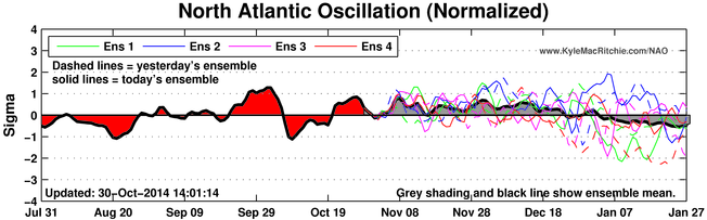
You can see that we start winter with a generally positive NAO, but, as December slips into January, we see those numbers start to decline and the NAO eventually goes negative.
There are also some lesser known teleconnectors, which we’ll look at now. The two main ones used for winter forecasting in our area are the PDO and QBO. The PDO is the measurement of monthly temperature anomalies in the sea surface in the Northern Pacific. Currently, it’s been positive for the last 8 months, with the most recent reading being +1.08, and there are no reasons to believe that that won’t continue. As a result, we expect a +PDO to continue throughout the winter. The PDO results in similar sensible weather to the El Nino, given that they are closely related, and so it’s another argument for a below average winter temp wise and above average precip wise. The other major index that we’re looking at is the QBO, which is a measurement of stratospherical wind oscillations at the equatorial longitude. The QBO usually cycles in 12 to 15 month phases, and currently, we’re in a negative phase which has been continuing since the spring. On that timeline, we should continue to see a negative QBO throughout the winter. There is a strong correlation between a –QBO and stronger high latitude blocking, which can lead to storms slowing down over the area and as a result leading to more prevalent precipitation from those systems. As a result, we can use the –QBO as a sign for above normal precipitation. The –QBO is also correlated to the –AO, which allows for polar air to flow down into the northern tier of the US, bringing below normal temps to the area. This is just one of several arguments for a –AO, we will discuss the rest in the current conditions section.
Overall summary of teleconnectors: Favorable for below normal temperatures and above normal precipitation.
Next, we’ll look at current conditions and see how they suggest the upcoming winter might play out. The most important of those is the extent of snow cover in Siberia, which is strongly correlated with the development of a –AO and cold air working it’s way south into the northern tier of the US. Below is a graph of snow cover in 2014 in Siberia compared to recent years. Thank you to “cfbaggett” at AmericanWx Forums for allowing us to use his graph.
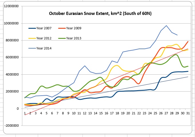
You can see that the extent of the snowcover in 2014 is higher than all the other years on this graph by quite a bit. Looking back to the beginning of when the dataset was collected, in fact, this year looks to rank as either the second or third greatest extent on record! This strongly suggests the development of a –AO, leading to cooler than normal temperatures as we discussed earlier. Snowcover is declining over the last few days due to a warm spell in Western Eurasia, but the value is still well above average and strongly suggests a –AO developing.
The other current condition that we examine is the state of the stratosphere, which can suggests potential SSW events, which often propagate colder weather down into the CONUS as warmer air fills the stratosphere. There’s quite a bit of disagreement on guidance right now as to where we’ll see the stratosphere go in the next few weeks, but it looks like signs are becoming stronger for a possible SSW sometime in December, which would set things up for a cooler period in January/February. We aren’t weighting this factor very heavily due to the chaos in the data and our relatively low understanding of it compared to some of the other factors, but it’s worth keeping in mind.
Overall summary of current conditions(Snowcover and Stratosphere): Below normal temperatures suggested due to strong snowcover suggesting a –AO.
Finally, to complete our overview of factors effecting the winter forecast, we turn to analogs. An analog year is a year that had a similar upper air pattern throughout the fall and had similar values on the indexes and overall weather pattern. The CIPS has a model which analyzes the upper air data and returns a daily list of top analogs to fit that data. Looking through the results from the last several weeks, these winters pop up the most in that data and seem to have the best fit to the pattern that we’re seeing this fall.
The three best fitting analogs for this winter, constructed from the CPC lists and my own analysis and opinion, are 2003-04, 2009-2010, and 1979-1980. As a result, I have included them twice on the composite maps, which means that they are given twice as much weight as the other two analogs which I included, 2002-2003 and 1976-1977. I included 1976 only because it has the record for largest extent of snowcover, and while the remainder of the upper air is not incredibly similar, I think that the extent of the snowcover will play a major role in giving us a –AO and thus cooler temps and as a result I decided to include it at minimal weight. When we average these 8 datapoints on composite maps of temperature and precipitation departures for December-February, we get these maps.
Overall summary of analogs: Below normal temperatures and below normal precipitation.
So, we’ve looked at all of the concepts and data that’s going to make it into the winter forecast. Now, let’s figure out what it’s all pointing to.
As a reminder, here’s what we came up with.
All in all, to summarize the long range models: Normal temperatures and above normal precipitation.
All in all, to summarize the ENSO: Weak to moderate El Nino, which means slightly below average temps, above average precipitation, and above average snowfall.
Overall summary of teleconnectors: Favorable for below normal temperatures and above normal precipitation.
Overall summary of current conditions(Snowcover and Stratosphere): Below normal temperatures suggested due to strong snowcover suggesting a –AO.
Overall summary of analogs: Below normal temperatures and below normal precipitation.
So, what does this all break down to? As far as temperatures go, everything except the long range models agree on below normal temperatures, and as a result, it’s pretty clear that the forecast should be for a colder than average winter. Looking at the data and some of the values that we pulled, we probably aren’t looking at extreme cold, but sustained below normal temperatures are expected, and that’s why we’re going with a range of one to two degrees below normal.
As far as precipitation goes, we again have a strong cluster of evidence pointing towards above normal precipitation. The one exception is the analog set, which features below normal precipitation. Given the volatility possible in any given year, having this as the only outlier isn’t enough for me to stray from the consensus forecast, and so as a result, we’re going with 115-165% of normal precipitation.
Finally, we have snowfall. Considering we have below average temps and above normal precipitation, snowfall also stands to be above normal. We’re thinking the same general range as we did with temps, with 115 to 165% of normal snowfall expected, with the higher end of that range being seen in areas that have lower average totals (Shoreline/CT Valley).
That just about does it for this outlook! We’ll take another look at it around the new year, and make some adjustments as needed based off newer data and what we’ve seen so far this winter.
Before we go, we’d like to remind you that we love questions and comments, so if there’s anything you’ve read here that you want more information about, have a question about, or just want to say something about, leave us a comment on this post and we’ll reply ASAP! I’m offline for most of today (11/1), so there might be a slight delay, but we’ll get your questions answered as soon as we can, we promise.
THANK YOU for reading the 2014-2015 Southern Connecticut Weather Winter Outlook, and again, welcome to the new Southern Connecticut Weather 2.0!
Yours in Connecticut Meteorology,
Spencer Aronstein(SA), Lead Forecaster, Southern Connecticut Weather.
spencer@southernconnecticutweather.com
Copyright 2014 Spencer Aronstein. All rights reserved.
www.southernconnecticutweather.com
www.facebook.com/southernconnecticutweather